
Image formats: Color models for humans and devices
Images are everywhere on the web. Every day, I view, create, send, and edit multiple images, and add images to my applications in several different ways. But what makes images look the same or look different and in which cases? I've even written blog posts about images, and the more I learn the more I discover how much happens behind the scenes to make an image look right. In this blog post series, I explain core principles that most image formats use, from the way our eyes see light, to how devices interpret and reproduce color.
If you're a developer, designer, or just curious about why your images don't always look the same across devices, this post dives into color vision theory and the mathematics behind color representation to explain how color and images are represented, transformed, and perceived by both humans and machines.
Images on the screen
If we start from the screen, an image is a set of lightened areas represented by screen pixels. Every screen pixel emits light with a different intensity and wavelength. This difference in wavelength is perceived as a difference in color by humans (and by cats as well, but that's a different story).
Note: Light can be considered either as a tiny set of particles (photons) or as an invisible electromagnetic wave. You should take into account that only a few devices can emit a "pure" (monochromatic) color—the color of only one wavelength. Most of the time we perceive a mixture of different wavelengths as a color, not a single wavelength. Diodes in our displays don't emit a "pure" color.
Images in the human eye and brain
The light from the image on the screen passes through the pupil, refracts through the lens, and focuses on the retina. The retina contains special cells called rods and cones. Rods help us see in low light, but they don't detect different wavelengths—that's why everything looks like shades of gray in the dark. However, in daylight, rods aren't active. Mosts of the models we are interested in are built for daylight conditions.
Cones are responsible for color vision. There are three types, and each type is sensitive to slightly different wavelength spectrum. S-cones are most sensitive to blue, M-cones to green, and L-cones to red. The signals from these cells take light sensitivity into account. The retina processes signals from all these cells and the signal is sent to the brain.
In essence, a light signal can be broken down into three responses from different cell types, each covering a broad spectrum. Our brain and nervous system can't process this spectrum directly, so they use mechanisms to interpret it. Essentially, red, green, and blue information is mapped onto three other parameters: luminance, red-green, and blue-yellow. This mapping allows us to distinguish one color from another. In reality, colors don't exist—they're just how we humans perceive electromagnetic waves.
Note: Brightness and luminance are different concepts. Luminance is a physical quantity measured in candelas per square meter, while brightness is based on human perception and related to light conditions (e.g., whether the lamp is on or off).
The brain is much better at detecting patterns and edges than slow-changing gradients. There are also specialized mechanisms responsible for edge detection. However, humans are less sensitive to high-frequency spatial components.
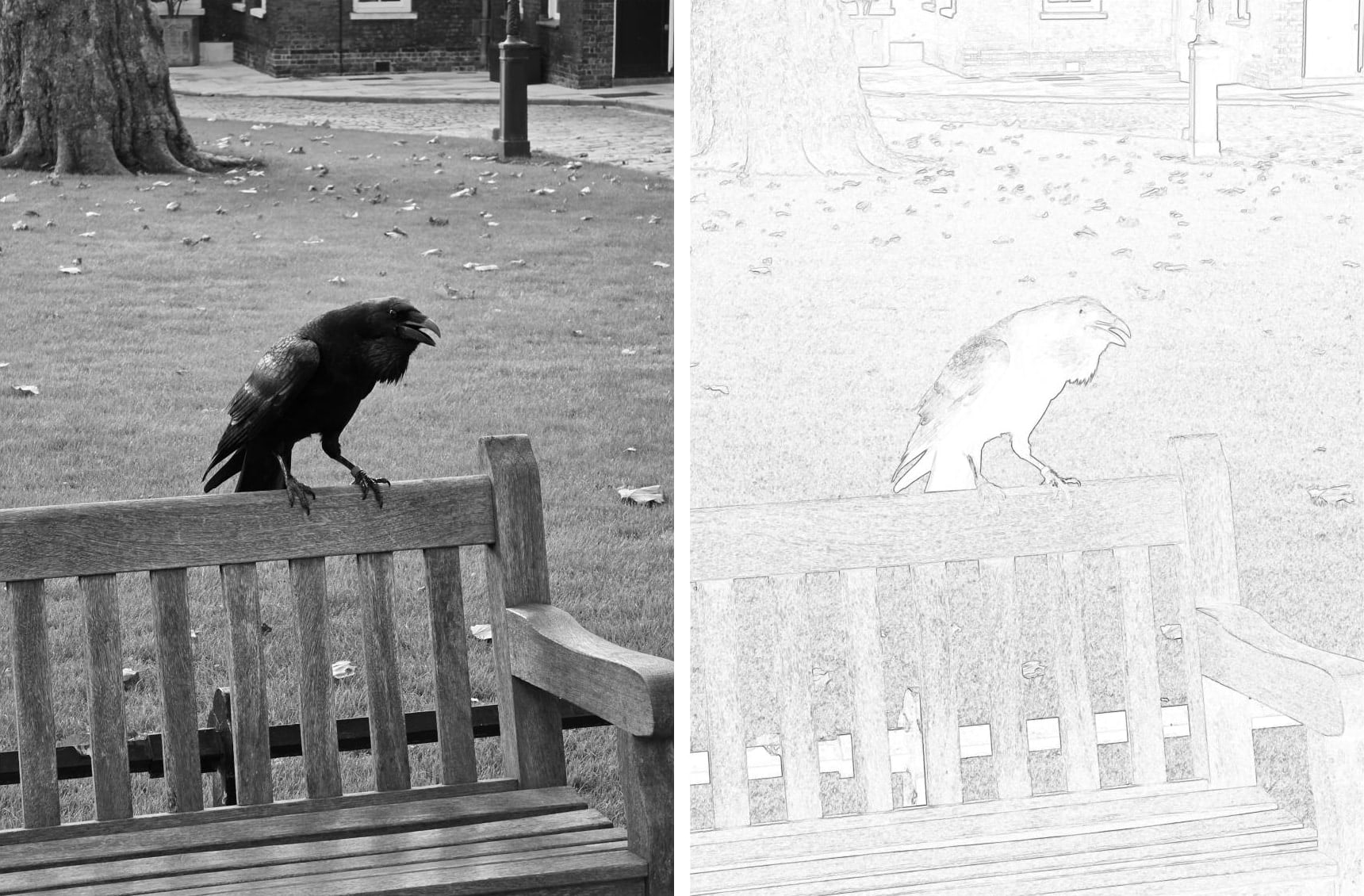
The original image is on the left and the image on the right is the output of an edge detection algorithm. Despite the fact that most of the information from the original image is removed, you can still perceive a raven on a bench.
How people perceive images greatly influences how image data is stored and processed. Image formats aren't about saving pixels in the most efficient way possible—they need to compress information while considering human perception and the characteristics of the display device.
Colors in research and on paper
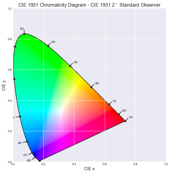
The CIE (International Commission on Illumination) conducted numerous experiments to create color models that represent how the average observer perceives light. The first example shows how an average observer perceives different wavelengths (i.e., different colors):

It might be apparent from the diagram that we are much more sensitive to green light. The mechanics of cones in the eye leads to the first color representation which you may be familiar with: RGB for red, green, and blue for each cone type. And we have CIE graphs for this—color matching functions. These functions represent different responses from different type of cones.

We can use this graph to get RGB representation for the color. To get three numbers, we need to get a sum of responses for every wavelength that the light contains. These numbers will represent our signal. And yes, different light signals can have identical RGB components.
You might also notice a problem with the previous graph: red sensitivity becomes negative, and of course, there are no negative colors. To fix this, the CIE came up with a different color representation called XYZ, which is a simple transformation of RGB that doesn't have negative values. As a result, we have a graph like this:

Let's look at how it's derived from RGB:
Note a big coefficient for green color. The human eye is most sensitive to green light, so the coefficient for green should be quite high. Y represents perceptual brightness, which is crucial because humans can quickly notice changes in brightness. That's why this information needs to be stored and represented as accurately as possible. X and Z are responsible for color. This allows us to separate color information from brightness, which is related to how the brain processes signals.
Color spaces
Now we have three numbers to represent a light signal. All possible triplets of these numbers constitute a color space. We can also represent this as a 3D shape. If you have a Mac, you can use the ColorSync Utility app to see how it looks.
However, 3D is not always convenient. Let's flatten the picture by throwing away luminance (Y). We will get a famous chromaticity diagram.
Note: Before plotting chromaticity, we need to normalize X and Z values by dividing them by X + Y + Z.
The saddle-like figure represents all colors that can be perceived by a standard CIE observer. The problem with this diagram and with XYZ color space is that it doesn't represent the difference between colors as an observer perceives it. It's also inefficient for encoding pixel values because many XYZ values do not map to perceivable colors, which results in wasted bits.
However, XYZ is a very useful tool for constructing device-specific color spaces. Each device has its own unique color rendering characteristics. For example, two red objects may appear slightly different on two devices. To account for this, device-specific color spaces were introduced.
Here is a rough idea of how it works: we take a red color signal that corresponds to (1, 0, 0) and measure the device-emitted light, calculating the XYZ for this point. Then we do the same for green, blue, and white (white is when all values for RGB are at maximum). These XYZ points are called RGB color primaries.
And voila, we get a set of coefficients to convert device-specific RGB primaries to device-independent XYZ values and back. RGB, which we typically use on the web, is called sRGB or standard RGB. It's a set of coefficients specific for "standard" device. Here they are:
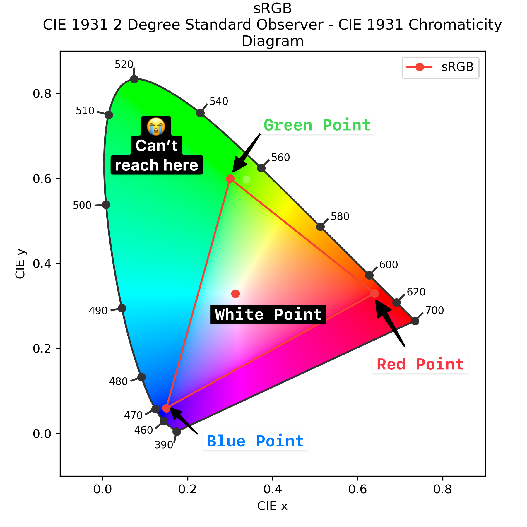
sRGB cannot represent all possible colors human eye can perceive. Let's go back to our diagram. Here are all the possible colors:
And here are the points used to get RGB coefficients for sRGB. We're bounded by the sRGB triangle, so we can't represent more colors:
Color in the L*a*b*
To address the issue with color distances, CIE introduced another color space—CIE L*a*b* which can be derived from XYZ. To make it represent color proximity similar to human perception, all coordinates in XYZ are transformed in a specific way. These transformations are not linear (it would be impossible to represent color proximity with linear transformations only). L* represents lightness and derived from Y, a* and b* represent the color dimensions and derived from X and Z.
Lab color space uses two axes to represent color: a* and b*. a* encodes a red-green component, while b* encodes blue-yellow. There is no way to represent light signal with both strong green and red components in the L*a*b* color space. Hovewer, a* and b* can be negative. For RGB, it's impossible as well: if we do something like (1, 1, 0), we will get yellow.
Let's see how it works on the example of converting RGB to Lab.
| Color | sRGB | Lab (L*, a*, b*) | Explanation |
|---|---|---|---|
| Red | 1, 0, 0 | 53.23, 80.11, 67.22 | +a* (strong red), +b* (yellowish) |
| Green | 0, 1, 0 | 87.74, -86.18, 83.19 | -a* (strong green), +b* (yellowish) |
| Blue | 0, 0, 1 | 32.30, 79.20, -107.85 | +a* (reddish tint), -b* (strong blue) |
| Yellow | 1, 1, 0 | 97.14, -21.55, 94.49 | -a* (slight green), +b* (strong yellow) |
These types of color spaces are called opponent-based. How the brain processes signals is encoded into the color space. The distance between two colors in Lab space is designed to map to perceptual distance. Look at the example: in the first row the distance between two colors is 7.5, in the second row it's 148.09.
If two colors look similar to people, they will have a smaller distance between them in the Lab space.
And there is more! CIE L*a*b* doesn't depend on any device, since it's derived from XYZ. However, this derivation takes the light condition into account for another human perception feature: chromatic adaptation. To calculate Lab values, we need to provide XYZ coordinates for "normal daylight conditions", which is often referenced as a white point (or "D65"). The final formula can be found on Wikipedia.
A More Intuitive L*a*b transformation
If you're feeling overwhelmed or confused at this point, let's try to understand with some other examples. Look at the following two Lab colors and try to guess how they are related:
63.76,  29.08, 66.2
63.76, -66.2,  29.08
If you're not sure, look at a transformation of the L*a*b* space called LCH (lightness, chroma, hue). Lightness remains the same, C is a square root of a*2 + b*2 and H is an angle in degrees. This representation is more intuitive for most people. Let's convert the previous colors to LCH to see what we get:
63.76, 72.31, 66.29
63.76, 72.31, 156.29
So now we have the same lightness, the same intensity, but a different hue!
.first {
  background-color: lch(63.76 72.31 66.29);
}

.second {
  background-color: lch(63.76 72.31 calc(66.29 + 90));
}
Modern L*a*b*
CIE L*a*b* space was developed long ago in 1976 and it's not the only Lab which exists nowdays. CSS Color Module Level 4 specifies two labs. First one is CIE L*a*b* and another one Oklab.
Note: CSS Color Module Level 4 also defines additional CSS mappings for color spaces discussed earlier.
Oklab was developed much later in 2020 and aims to fix several issues with CIE L*a*b*.
- Oklab is even more uniform especially for blue hues.
- Oklab is better for machines as there's more stable numeric calculations.
- Oklab is derived from sRGB, so it's more familiar and intuitive for developers.
Oklab has its own LCH representation called Oklch. It's calculated similarly to LCH components and it aims to be even more uniform and intuitive.
The most common space sRGB and its friend YUV
L*a*b* and XYZ are rich color spaces, which can represent every color human can perceive. However, they're not very efficient for storing pixel values due to their wide range of values. Also, they are modern, designed to work with devices that can afford to waste some bits representing tiny details of color and luminance.
Images and video formats typically work with the sRGB color space, and GPU hardware is optimized for sRGB (we'll discuss this later). RGB is inspired by how the human eye works (red, green, and blue); however, it's not very convenient for image processing. That's why another color space is used - YUV. YUV is a set of three values Y (luminance), U (blue-difference), and V (red-difference). The main benefit of this space is that it separates color (U and V) from luminance (Y).
Note: There is some confusion around naming for the luminance, red-green, and blue-yellow systems. You can find references to YUV, YCbCr, and Y'CbCr. It looks like YUV and YCbCr can be used interchangeably. However, Y and Y' are different things. Note that in comparison L*a*b* YUV is not perceptually uniform.
If you look at image codec source code, most likely you will find a lot of lines related to conversion to and from YUV. Don't forget that sRGB is device-dependent. If we take a rectangle filled with some color, let's say (0, 255, 0) (green), it will look different on different devices.
Let's look how YUV coordinates are derived from RGB. We saw this principle before, first we separate luminance:
And again, we saw that green light makes the biggest contribution. U and V are a Blue and Red difference from Y. Note that coefficients in the denominator are to scale U and V from -0.5 to 0.5:
Let's try on a squirrel and compare the original image with separate Y, U, and V channels:

This separation is so important because people are more sensitive to luminance than to color. To process an image correctly, it often makes sense to do some transformations on the Y channel only, or use different transformations for Y and UV channels. These channels are typically compressed differently.
Humans and devices perceive things differently
Let's discuss another feature of our perception - how we perceive brightness, which is very different from how devices reproduce it. We perceive brightness logarithmically, while devices reproduce it linearly. Logarithmic perception means that we can distinguish wide range of brightness. For example, a log 5 scale (1: 100000) is fine; it can be even bigger if our eyes are adapted to environmental conditions. If you're curious to dig deeper, this effect is described by the Weber-Fechner law.
This is an issue because the range of brightness that common devices can capture and display is much smaller than the range that we can perceive. Many professional cameras and displays support wider range of brightnesses, so it varies widely. Let's consider an example: which gradient looks more even?
.first {
  background-image: linear-gradient(
    to right,
    rgb(0 0 0),
    rgb(128 128 128),
    rgb(255 255 255)
  );
}

.second {
  background-image: linear-gradient(
    to right,
    rgb(0 0 0),
    rgb(180 180 180),
    rgb(255 255 255)
  );
}
For most people, the first gradient looks smoother, and the true "linear" gradient is the second one. If you look at the example more closely, you might notice some little lies. The first gradient has 128 (255 / 2) in the middle. It's exactly linear, right? It's actually not, because the RGB values we use in CSS are gamma corrected. Gamma correction is used to provide a better perceptual picture and store bits more efficiently.
To get a gamma-corrected value from the linear one, we scale the value to [0, 1] and then use a power function (as Weber-Fechner law suggests). We use 2.2 as a power because it's close to how human perception works.
The real formula which is used in sRGB is a little more complicated, but it's very close to the above. Here is an actual transformation: every channel R, G, B is transformed in the same way.
This also gives dark shadows 'more bits'. The 'real' avarage is somewhere around 180, not 128. This is aligned with how human perception works - we are more sensitive to dark shadows.
Y' is a gamma corrected version of Y. It's calculated in the same way as Y, but with gamma corrected R, G, B. The particular formula used for gamma correction is color space dependent. This is called transfer function.
From camera to screen
Quite often, we want to take a photo on our phone and share this photo on our favorite social network. When your friend looks at the photo on her laptop, it's nice if the the colors look the same, right?
To make this happen, the colors captured by the phone camera should be mapped to the colors on the screen properly. Remember that efficient color spaces are device-dependent. Which means, for example, that the (127, 0, 0) RGB value has different colors on different devices. To align colors, an additional channel of information is encoded to the image. There are three things specific to a device color space:
- Three color primaries
- A white point
- A transfer function
Let's see how it works for AVIF images. Like many image formats, AVIF tries to do its best to reproduce colors accurately. It uses two things to do so: a color profile and CICP (Coding-independent code points). A color profile is used in most image formats generated on the device where the image was created and allows to reconstruct colors properly. It provides precise color control and contains coefficients to color primaries, transfer function and white point. It also may store lookup tables with pre-calculated transformations. CICP are typically used in video, and it's much simpler than ICC profiles.
Note: You can find a great explainer on the libavif wiki on GitHub.
It consists of three values. Every value references rows from tables in the publicly available H.273 standard.
- MC
-
A set of coefficients to convert RGB to whatever color space you want. Typically to convert RGB to YUV.
- TC
-
A non-linear transfer function to take into account device-specific characteristics and perform gamma correction.
- CP
-
Color primaries to convert RGB to XYZ.
For example, it could be 1/13/6, which means to take rows 1, 13, and 6 from the specific tables in the standard. If the image contains a color profile, the CP and TC values are taken from the profile, but MC is still taken from the CICP.
Let's look at how the process works for AVIF images. We are reading CICP and getting 2/2/6, which means:
- CP - unspecified
- TC - unspecified
- MC #6 defines standard RGB to YUV conversion which is the same that JPEG uses.
To get more information, we need to look at the ICC profile. Here we find color primaries, a transfer function and white point. This information is used to convert a decoded bytestream to the device color space. During this process, the image might be converted to XYZ and an intermediate color space, and then to the device color space.
The decoding process is oustide of the scope of this post, but one thing to mention is that MC coefficients are used. The result is sent to the GPU and displayed on the screen.
What if I want stunning photos?

When I look at a sunset, I can see both the sky and the details of the buildings. However, if I take a single photo in JPEG format, I have to choose between capturing the sky or the buildings. In this case, the bright sky is well-exposed, but the buildings merge into a single dark blur.
How can we make it better? The range of colors and brightness levels we can perceive is much wider than what low-end devices can capture and reproduce. This wide range is typically referred to as high dynamic range (HDR).
To get the best out of an image, we need four things:
- A device capable of capturing a wide range of colors and brightness levels (such as a professional camera or certain smartphone cameras)
- A file format that can efficiently store this range
- Software that can properly decode the image
- A display that can accurately reproduce the range
If all these conditions are met, we get images with more detailed shadows and highlights, along with vivid colors. However, if any of these conditions are not met, we end up with an SDR (Standard Dynamic Range) image.
Professional cameras excel at capturing HDR photos. They use a lossless RAW format, which is significantly larger than standard image files. With proper post-processing, details can be revealed by applying different transformations to various parts of the image.

As for software - modern browsers support HDR on some operating systems.
Many screens can reproduce HDR images, but if a device is not capable of displaying HDR, the image must be converted to SDR. To preserve details, different tone mapping techniques can be used. These techniques can be applied automatically by the browser or manually by the user. Without tone mapping, the image may appear too dark, too bright, or dull.
Let's check how it works in your circumstances. Compare two images:
If the second image looks more vibrant, your device and browser can render HDR images.
The problem with tone mapping is that it is applied uniformly across the entire image. A better approach is to adjust brightness for specific areas—or even per pixel—using a gain map. You can think of a gain map as a grayscale version of the image, where each pixel's actual brightness is multiplied by the corresponding value from the gain map. This gain map is embedded in the image file. While JPEG and AVIF support gain maps, the feature remains unstandardized and experimental.
Even if a display can reproduce HDR, storing and transferring RAW files is expensive and inefficient. The most straightforward solution is to use a modern image format with a higher bit depth—such as AVIF. AVIF can store 10 or 12 bits per channel, allowing for a much wider range of colors and brightness levels.
Wrapping up
In this post, we learned how human perception influences the way light signals are represented in devices. Let's summarize what we covered:
Color spaces are used to represent light signals. Some color spaces are device-specific, while others are universal and independent of the device. Certain color spaces, like sRGB, are optimized for representing light signals in images and videos. Others, like LCH (Lightness, Chroma, Hue), are designed to represent color relationships in a way that aligns with human perception.
To maintain consistent color across devices, we must convert from a device-specific color space to a universal color space (e.g., sRGB or XYZ) and back. Additionally, special transformations, like gamma correction, are applied to account for the non-linear way humans perceive light and color. Some color spaces allow separate color from lightness which is very beneficial for image compression, as we will see in the next post.